My M&M's
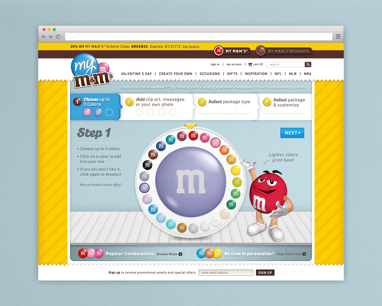
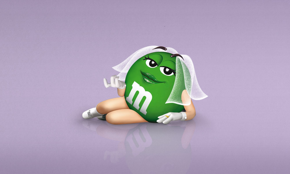
Our team at Silverlign was tasked with presenting a few sample pages for a potential My M&M's site redesign. The existing site lacked a clear user experience and the fun the M&M's brand is known for. We immediately saw an opportunity to interject the needed personality and guide users by featuring the M&M's characters more prominently. However, with only found assets to work with, I chose to illustrate the environment for our character 'tour guides' to interact with.
Work created at Silverlign Group
Role: Design/Illustration | Design: Katharina Klein | Creative Direction: Hubert Shum & Tim Kain


